Client: Tracer
Year: 2025
Project Overview
Art Direction, Digital Design, Branding, Layout Design
Software: Adobe Photoshop, Adobe InDesign, Adobe Illustrator, Figma
Software: Adobe Photoshop, Adobe InDesign, Adobe Illustrator, Figma
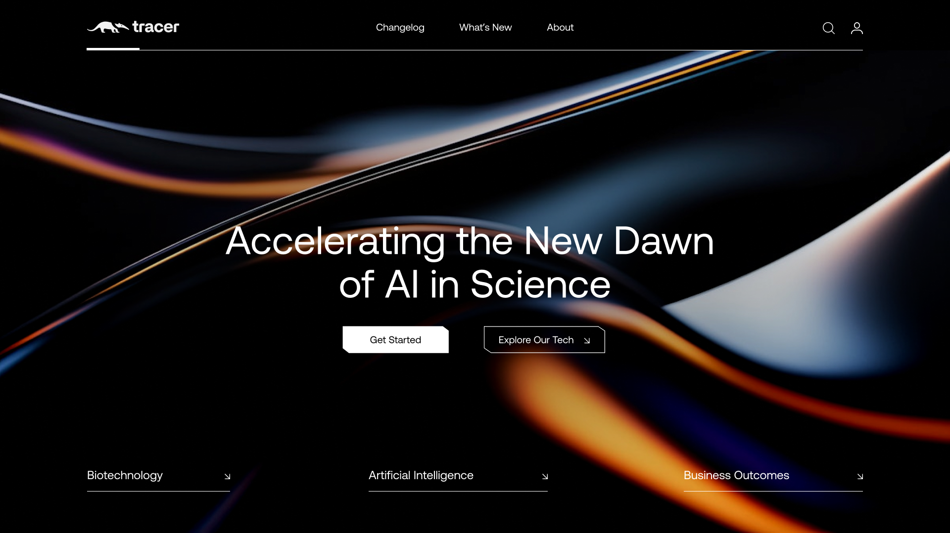
This project focuses on the redesign of Tracer.bio’s hero section and the development of a structured whitepaper highlighting their AI-driven observability solutions for high-performance computing (HPC) in biotech. The aim was to position Tracer.bio as a leader in AI-powered scientific analysis while modernising their digital presence.
The hero section was designed to be visually compelling and informative, emphasising how AI accelerates scientific advancements. At the same time, the whitepaper was crafted to outline the cost benefits and performance improvements of Tracer.bio’s observability solutions, providing a data-driven approach to showcasing their impact on biotech innovation and cost optimisation.
Strategic Positioning &
Target Audience Alignment
Target Audience Alignment
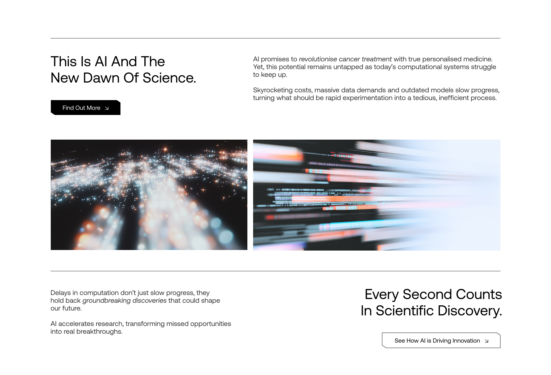
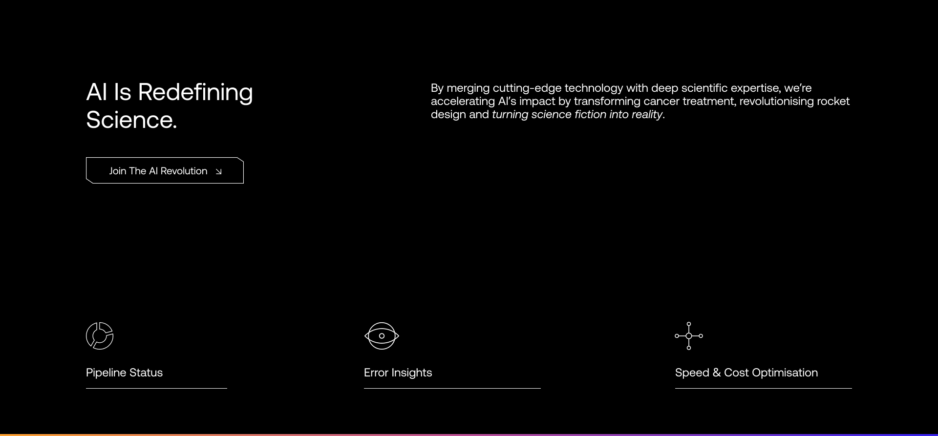
Given Tracer’s focus on high value contracts and enterprise level engagement, the hero section is designed to immediately communicate innovation and impact.
The bold, high contrast visuals and dark theme reflect cutting-edge AI and scientific breakthroughs, reinforcing Tracer’s advanced technological positioning. The clean, minimal layout ensures the core message remains the focal point, making it easy for busy executives and decision makers to quickly grasp Tracer’s value.

User Experience &
Conversion Optimisation
Conversion Optimisation
The layout prioritises scannability and logical flow, ensuring that visitors can quickly absorb key information. The strategic placement of CTAs ensures users are naturally guided toward engagement points. Each CTA incorporates different copy to attract attention throughout user navigation.
Additionally, the inclusion of category links (Biotechnology, Artificial Intelligence & Business Outcomes) provides intuitive navigation paths tailored to Tracer’s diverse audience segments.

Visual & Brand Consistency
The high contrast, fluid imagery conveys speed, transformation and precision all of which are key themes relevant to AI-driven scientific advancements.
The subtle use of colour accents highlights key phrases without overwhelming the user.
The choice of typography and spacing maintains a sophisticated and professional aesthetic, reinforcing Tracer’s credibility in the industry.
Branding Alignment
To ensure consistency with Tracer’s updated branding, I refined the typography and visual identity as well as incorporating the colour scheme through sleek visuals. I replaced the previous body font for a more modern and professional look and created a grid structure to support hierarchy.
The colour palette was integrated sparingly to reinforce Tracer’s enterprise identity, enhancing readability and visual appeal. Additionally, I optimised the layout structure, ensuring a clear content flow that improves engagement and reinforces brand credibility.
Copy Refinement
I adapted the tone and language to better resonate with an enterprise audience, ensuring clarity, professionalism and authority. Unnecessary jargon was removed and key messages were sharpened to improve readability and impact.
I also refined the structure of the content, making it more concise and compelling while maintaining a strong narrative that aligns with Tracer’s positioning.
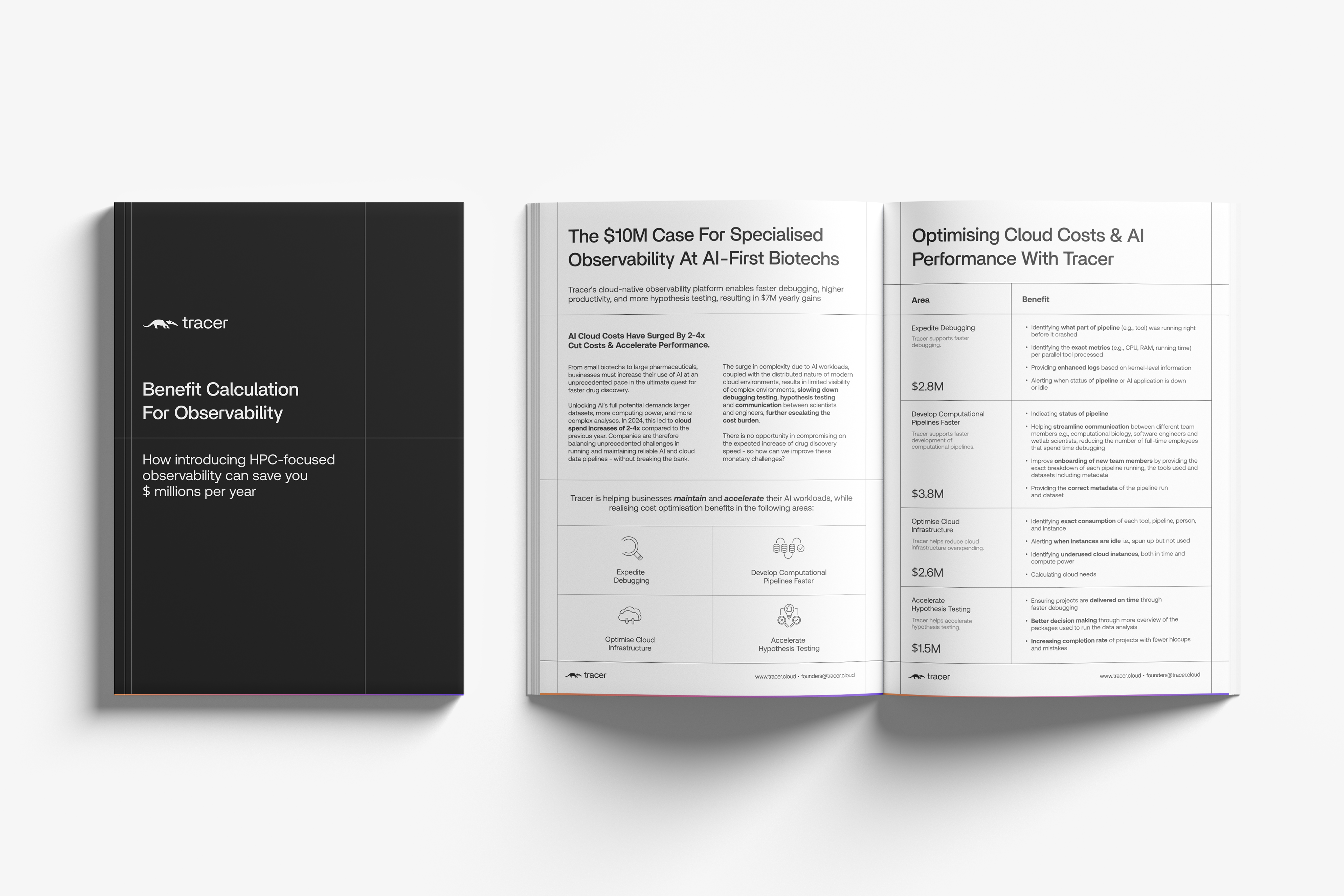
Information Flow
I redesigned the placement of the content to enhance logical progression and ease of understanding through the use of the grid system tying back to Tracer’s brand identity.
Key insights and value propositions were brought to the forefront, ensuring they capture the reader’s attention quickly. Headings, subheadings and bullet points were used strategically to break up dense text and guide the reader through the white paper in a more intuitive and engaging way.
Design Optimisation
The layout was refined to create a clean, professional and visually engaging document that incorporated Tracer’s new style of branding and visuals.
Spacing, alignment and formatting were adjusted to improve readability and ensure a cohesive design. I incorporated branded design elements and graphical highlights to emphasise key takeaways, making the white paper both informative and visually appealing while maintaining enterprise-level polish.