Client: Fushi
Year: 2024
Project Overview
Social Media Design, Digital Strategy, Graphic Design, Content Creation
Software: Adobe Photoshop, Adobe InDesign
Software: Adobe Photoshop, Adobe InDesign
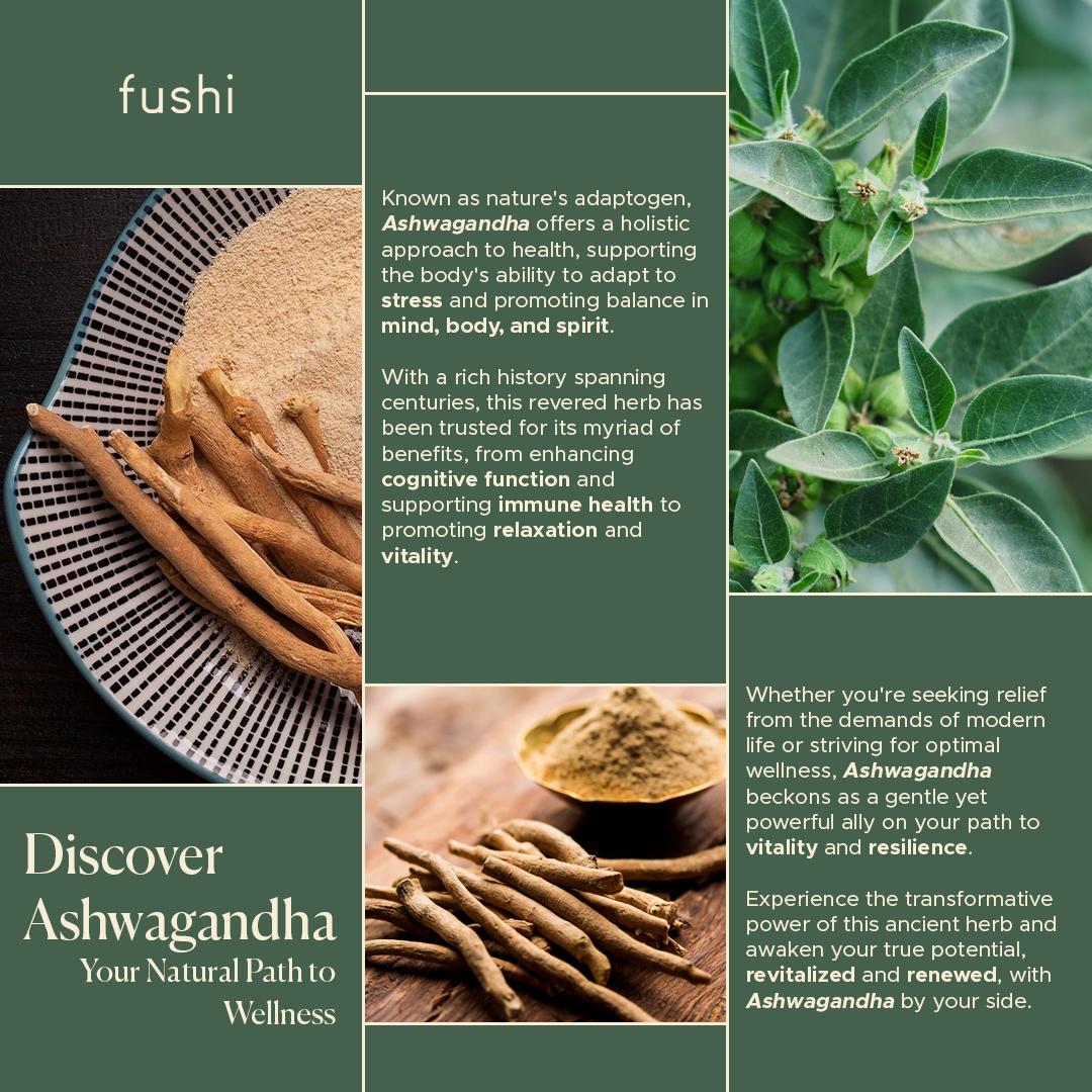
In collaboration with Fushi, a leading Ayurveda product company, I undertook a project to design
a social media carousel and a homepage banner to showcase one of their flagship offerings, Ashwagandha.
a social media carousel and a homepage banner to showcase one of their flagship offerings, Ashwagandha.
Focusing on digital design, I crafted visually engaging assets tailored to their brand identity and marketing objectives.
This project provided an opportunity to demonstrate my expertise in digital design and content creation, while also showcasing my ability to blend modern aesthetics with informative messaging.
Approach
To ensure the design resonated with the target audience and aligned with the company's branding, I conducted thorough research on competitors and their product offerings.
This included studying their product packaging designs, colour palettes, typography choices, tone of voice, and social media strategies. Using this information, I created a comprehensive mood board that served as the foundation for the design direction.


Approach
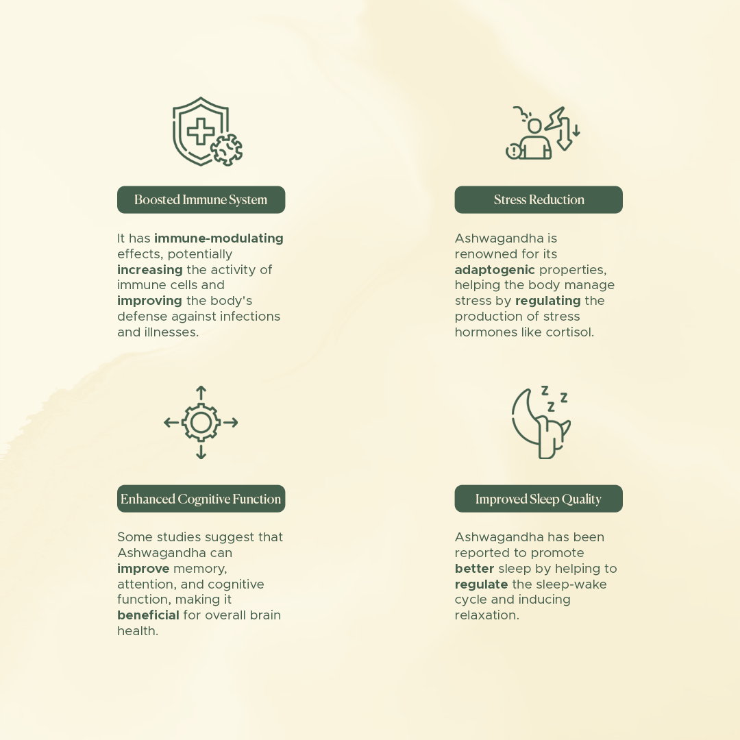
Drawing inspiration from the minimalist and modern trends prevalent in the Ayurveda industry, I crafted a stylish yet informative aesthetic for both the social media carousel and homepage banner.
By incorporating clean lines, subtle textures, and bold typography, I aimed to capture the essence of Ashwagandha's benefits while maintaining a visually appealing layout.
Outcome
The final design solution featured a cohesive blend of captivating visuals and compelling copy, effectively communicating the key attributes of Ashwagandha while adhering to the company's branding guidelines.
The social media carousel provided an engaging storytelling experience, while the homepage banner served as a captivating introduction to the product.
