Mayfair
Mayfair is an emblem of exquisite dining and opulence, providing its guests with an indulgent and unforgettable culinary journey. The primary aim of this rebranding initiative is to revitalise Mayfair's visual identity, infusing it with heightened levels of elegance, sophistication, and audaciousness while preserving its esteemed reputation for excellence.
In order to approach this project to encompass the brief, I had began researching restaurants of similar tier and status, gathering information such as the colour-schemes used, font choices and the styling of their logo marks.
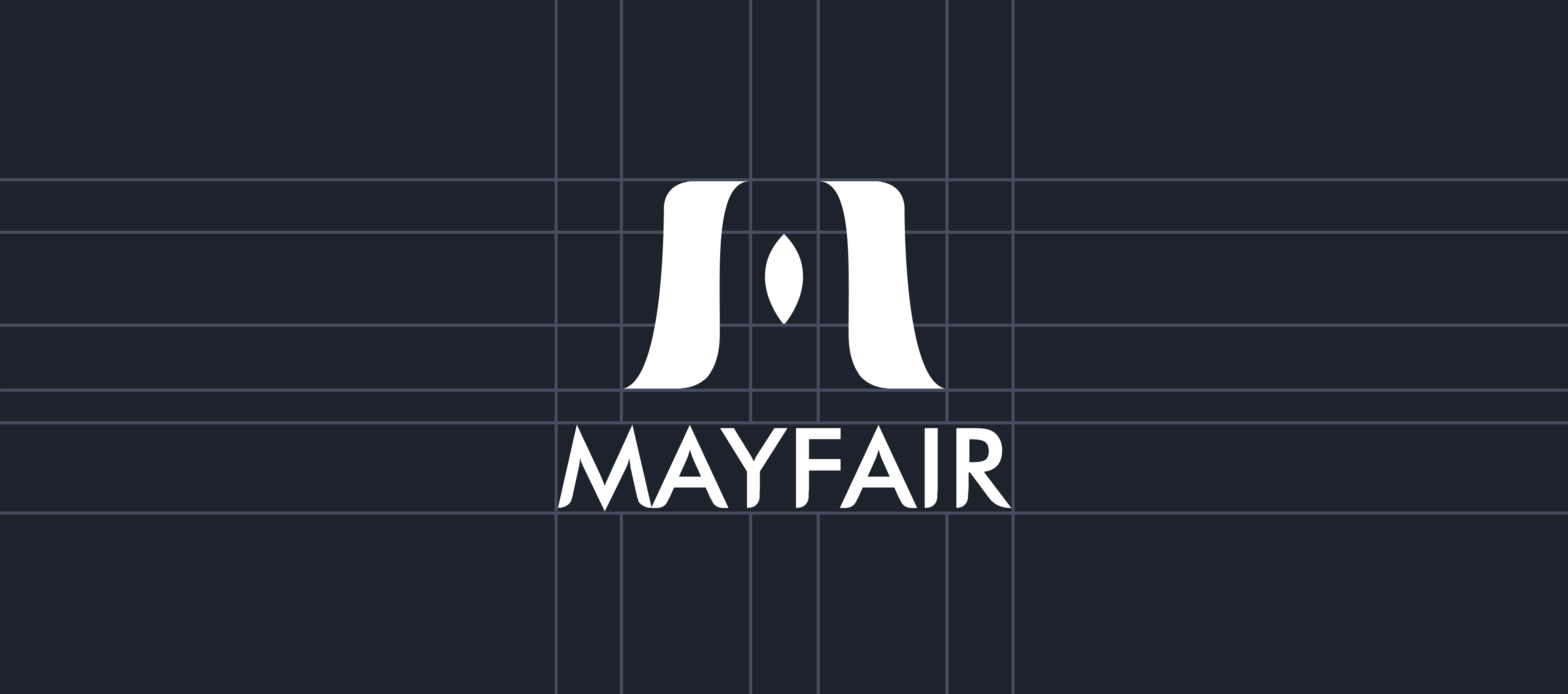
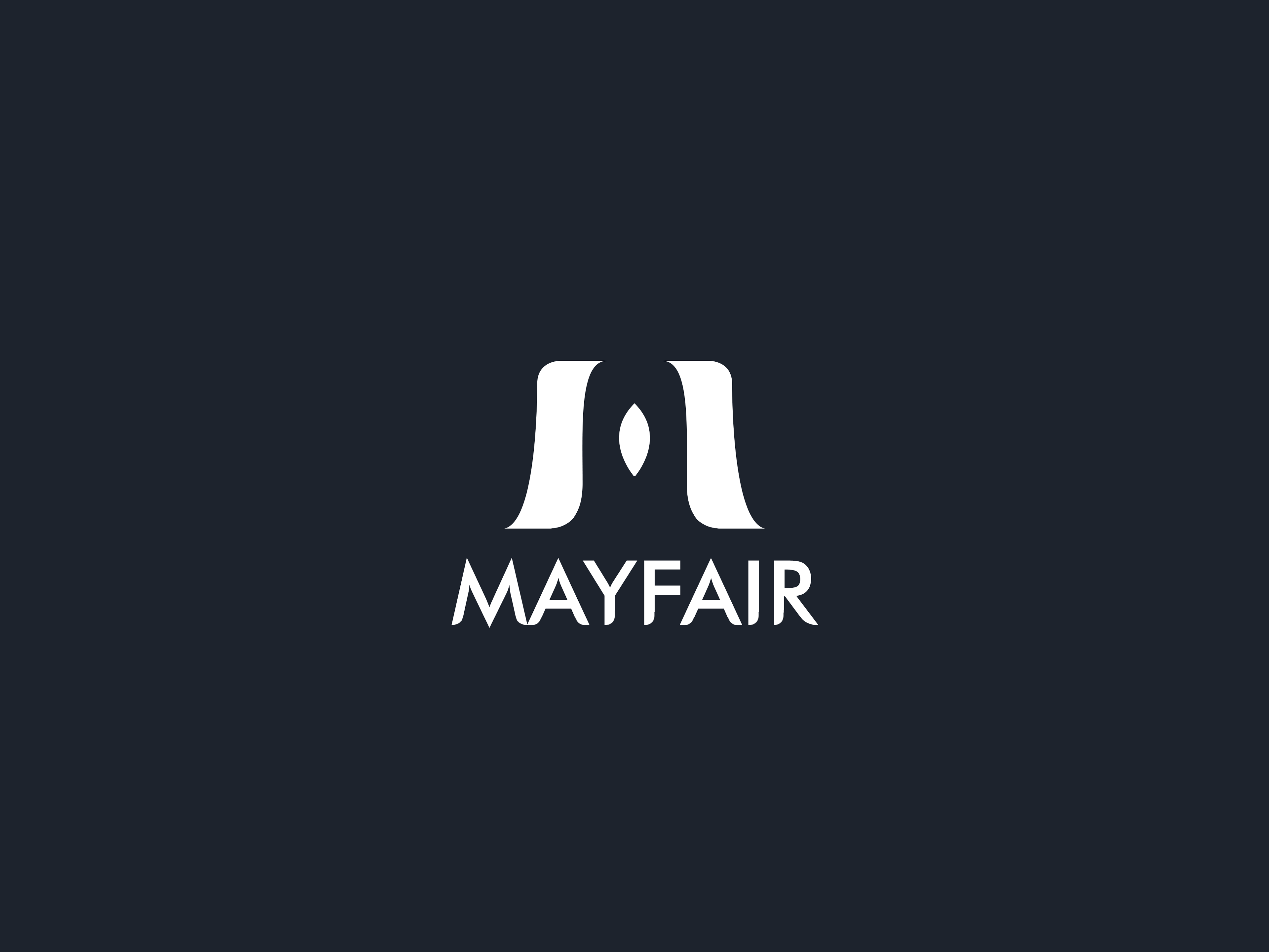
After I had conducted my initial endeavour into the fine-dining restaurants within London, I began sketching and developing what is now considered the 'M' logo for Mayfair.
Logo Design
I created both a distinct logomark and a unique logotype, providing the company with multiple means for customers to identify the restaurant. This versatility enables the logo to be effectively utilised across various mediums and formats.
The use of the oval shape in the middle encompassed by the body of the 'M' represents a homely and safe feeling which Mayfair provides by catering to their customers in a caring manner.
As for the logotype, a sans-serif font was used for the base in which I rounded the edges of the type to cater to the briefing and vision of Mayfair being a sophisticated yet caring restaurant.
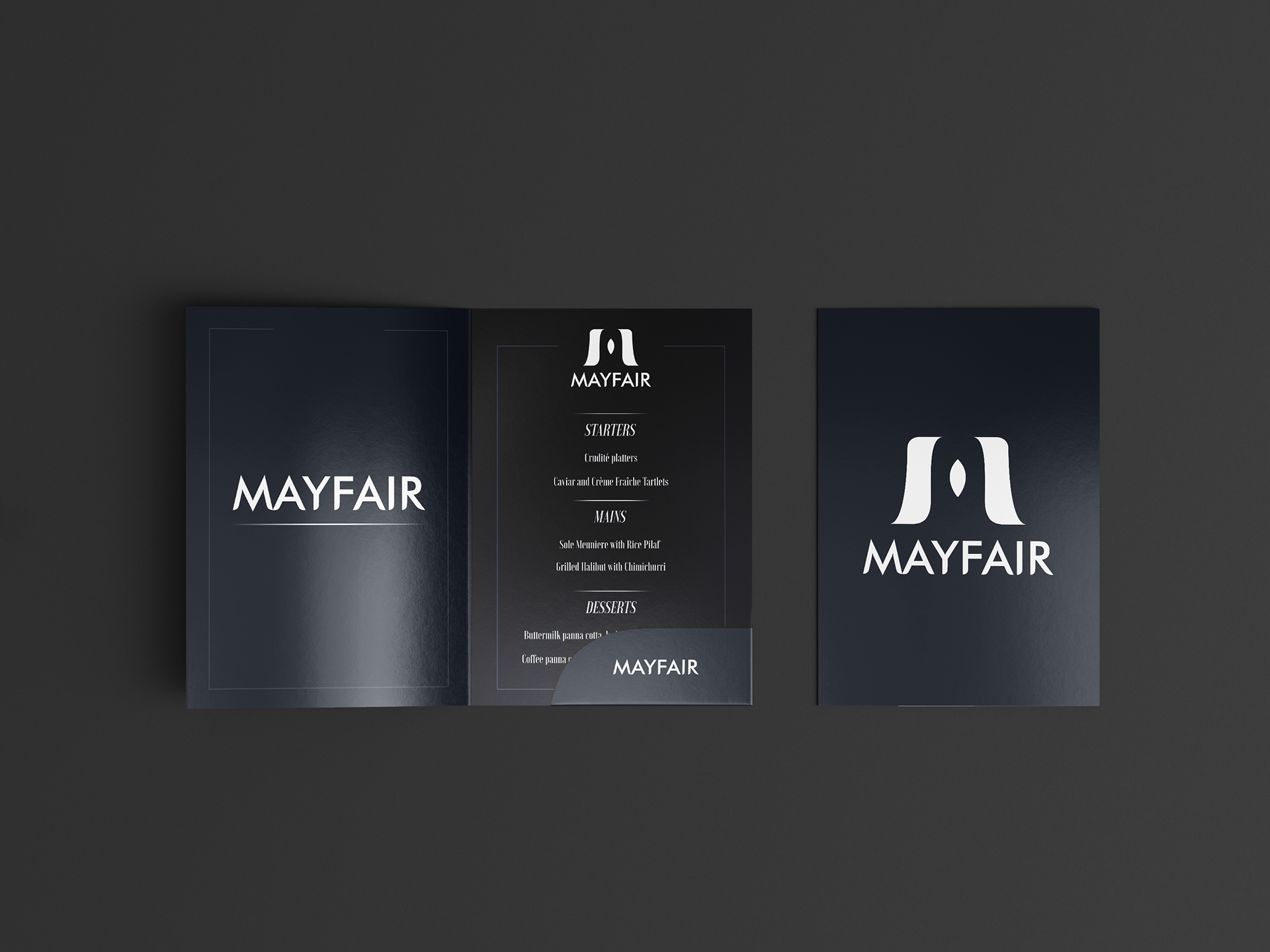
Mock-ups
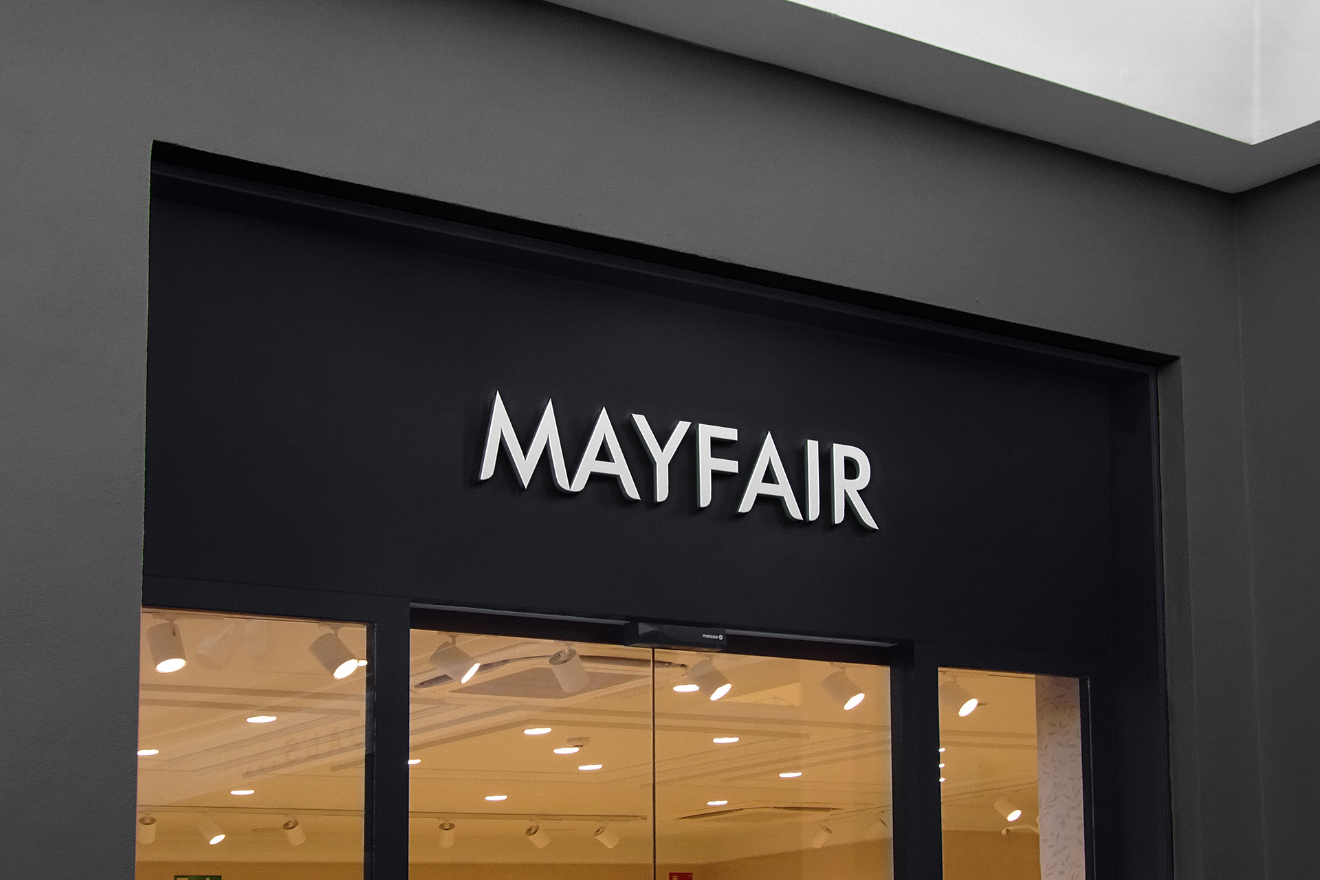
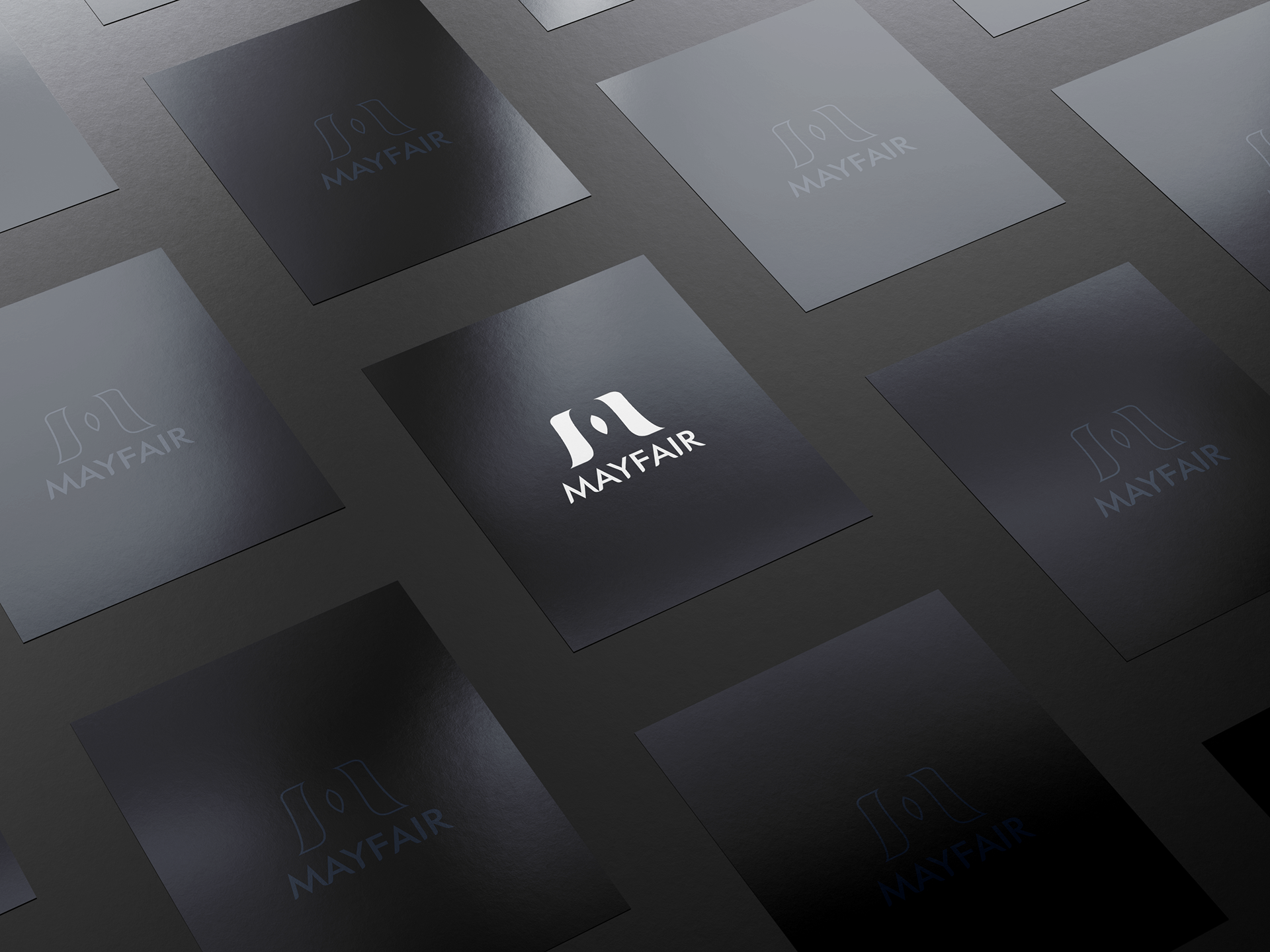
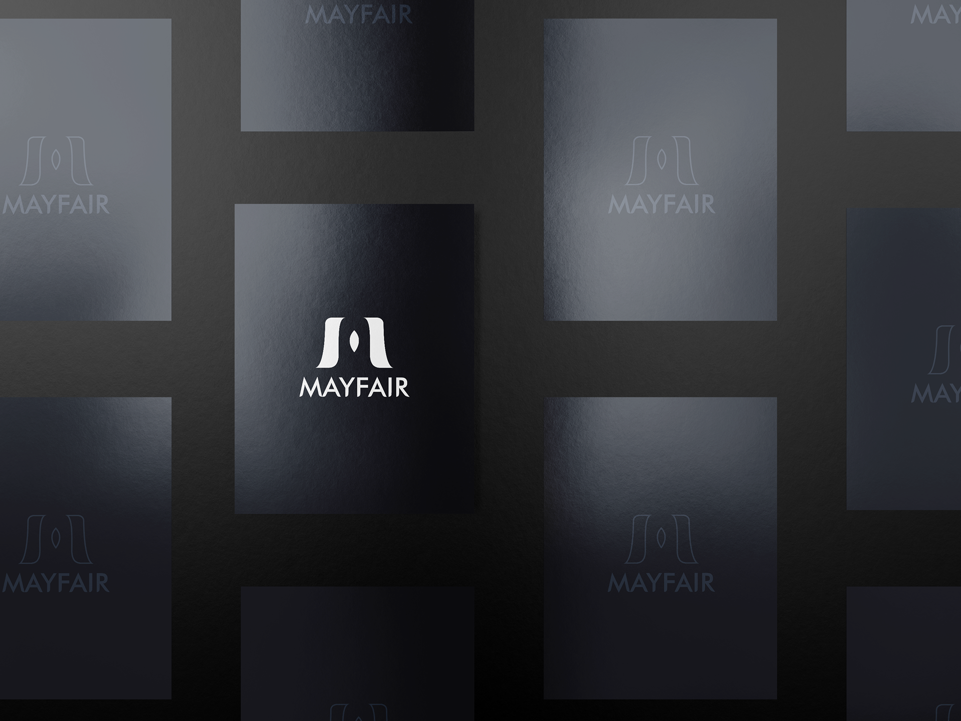
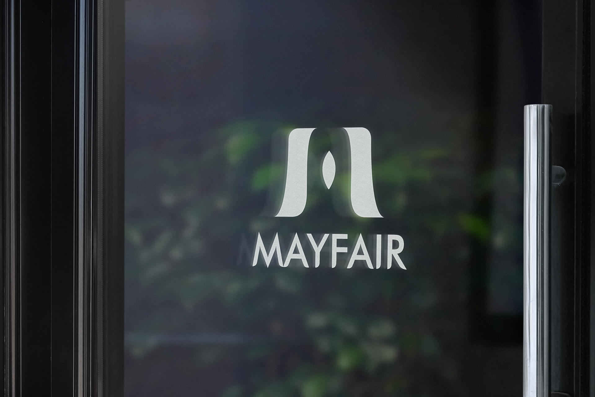
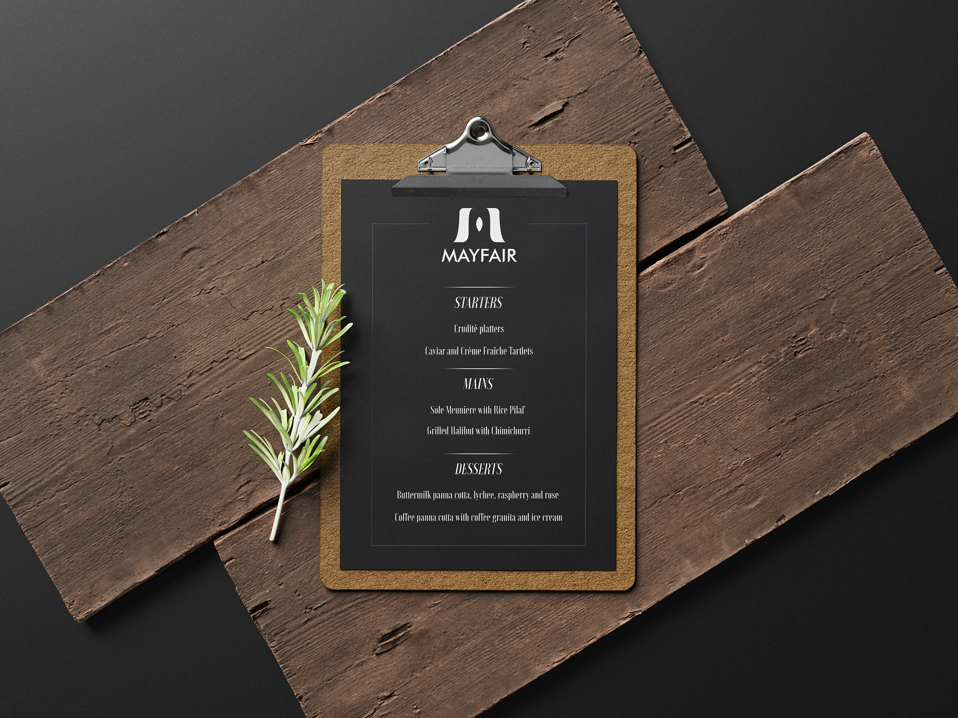
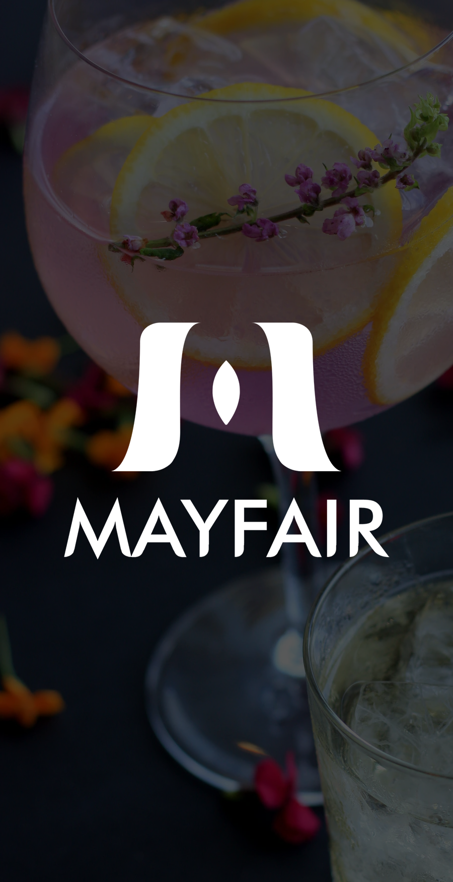
Below I have mocked up the logo with both the logotype on restaurant menus as well as the logotype at the forefront of a shop.
This helps to provide a greater understanding of the use and application of the logos by providing it a depth beyond the 2D logo as designed above.
Shop-front
Menu Covers
Logo Printed on Glass Door
Restaurant Menu


Softwares Used
Adobe Photoshop, Adobe Illustrator, Adobe InDesign